
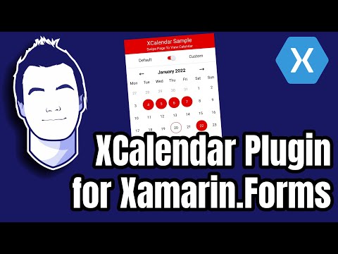
A cross-platform plugin for .NET providing a Calendar API and DateTime extensions.
UI controls are available for Xamarin Forms and .NET MAUI, able to run on any platform the respective framework supports.
- Getting Started
- Sample App
- Wiki
- Roadmap
- Nuget Package (.NET)
- Nuget Package (Xamarin Forms)
- Nuget Package (.NET MAUI)


- Ability to use the Calendar from code without referencing a UI framework.
- Ability to use and reference your own models by implementing interfaces like
ICalendar,ICalendarDay, orIEvent. - Ability to set the number of rows/weeks shown or have it be automatic.
- Ability to change the start of the week to any day of the week.
- Ability to select single, multiple or a range of dates.
- Ability to specify a selection direction, for example restricting range selection from start to finish or finish to start
- Ability to restrict navigation to a range of dates and define how the calendar loops.
- Ability to specify your own custom order of days of week, with support for duplicates and non-chronological orders.
- Fully customisable CalendarView with custom controls, templates, and exposed default styles and commands.
- Support for localising text (such as days of the week and day numbers).
- And more!
- Default calendar control that exposes many customisation properties, making the calendar easier to use out-of-the-box instead of requiring usage of templates and styles.
- Default implementation of selection and navigation commands, making the calendar easier to use out-of-the-box.
- Default feature-based calendar controls such as "EventCalendar"/"AppointmentCalendar".
- Some type of time schedule control Discussion 153
Culture/Localeproperty for CalendarView- YearView
- DecadeView
- CenturyView
- Day, Month, and year properties as an alternative to NavigatedDate.
Follow the discussion for moving XCalendar into the Maui Community Toolkit here.


The sample app has a flyout menu where you can access the following pages:
A page where you can modify almost every single property of the CalendarView. Perfect for a quick look, showcases, tests and experiments!


A page where you can search for examples of how to use XCalendar.

Examples include:


Animated.Swipable.Calendar.mp4

| Official App | Sample App |
|---|---|
 |
 |
public Calendar MyCalendar { get; set; } = new Calendar();public Calendar MyCalendar { get; set; } = new Calendar();xmlns:xc="clr-namespace:XCalendar.Forms.Views;assembly=XCalendar.Forms"<?xml version="1.0" encoding="utf-8" ?>
<ContentPage
x:Class="App1.MainPage"
xmlns="http://xamarin.com/schemas/2014/forms"
xmlns:x="http://schemas.microsoft.com/winfx/2009/xaml"
xmlns:xc="clr-namespace:XCalendar.Forms.Views;assembly=XCalendar.Forms">
<xc:CalendarView
Days="{Binding MyCalendar.Days}"
DaysOfWeek="{Binding MyCalendar.DayNamesOrder}"
NavigatedDate="{Binding MyCalendar.NavigatedDate}"/>
</ContentPage>
Alternatively, these properties can be set directly from code-behind without the use of MVVM.
public Calendar MyCalendar { get; set; } = new Calendar();xmlns:xc="clr-namespace:XCalendar.Maui.Views;assembly=XCalendar.Maui"<ContentPage
x:Class="MauiApp1.MainPage"
xmlns="http://schemas.microsoft.com/dotnet/2021/maui"
xmlns:x="http://schemas.microsoft.com/winfx/2009/xaml"
xmlns:xc="clr-namespace:XCalendar.Maui.Views;assembly=XCalendar.Maui">
<xc:CalendarView
Days="{Binding MyCalendar.Days}"
DaysOfWeek="{Binding MyCalendar.DayNamesOrder}"
NavigatedDate="{Binding MyCalendar.NavigatedDate}"/>
</ContentPage>Alternatively, these properties can be set directly from code-behind without the use of MVVM.
Navigation can be performed by setting the NavigatedDate property of the Calendar.
Alternatively, navigation can be performed using the Navigate method; it takes a parameter specifying the TimeSpan to navigate by. The Calendar can handle exceptions caused by non-representable dates such as DateTime.MaxValue.AddDays(1).
Variable time units such as months can be obtained by using the'AddMonths' method on a DateTime and subtracting the result from the current date. The 'TryAdd' and 'TrySubtract' methods in DateTimeExtensions are useful if you ever plan to navigate to the bounds of the DateTime struct.
Navigation can be limited to a specific range of dates by changing the NavigationLowerBound and NavigationUpperBound properties of the Calendar.
You can specify the behaviour of the CalendarView when trying to navigate outside the bounds defined by NavigationLowerBound and NavigationUpperBound by changing the NavigationLoopMode property.
The CalendarView does not have navigation built into it by default. Instead, it exposes the BackwardsArrowCommand, BackwardsArrowCommandParameter, ForwardsArrowCommand, and ForwardsArrowCommandParameter which can be used to implement this functionality.
The CalendarView displays its navigation bar using a NavigationView. Its appearance can be changed using the NavigationViewTemplate property of the CalendarView.
You can specify what day of the week should be considered as the start by setting the StartOfWeek property of the Calendar.
For Example:
- When
StartOfWeekisDayOfWeek.Monday, the first row of February 2022 would be 1st Feb - 7th Feb. - When
StartOfWeekisDayOfWeek.Wednesday, the first row of February 2022 would be 26th Jan - 1st Feb - When
StartOfWeekisDayOfWeek.Sunday, the first row of February 2022 would be 31st Jan - 6th Feb
You can set how many rows you want to display by changing the Rows property of the Calendar.
Alternatively, the Calendar can automatically set the Rows value to the minimum amount needed to display every week of the NavigatedDate's month. This can be done by setting the AutoRows property of the Calendar to true. You can ensure that AutoRows always uses the highest Rows value required in the year by setting the AutoRowsIsConsistent property of the Calendar to true.
For example, when the start of the week is Monday, these are the values that will be calculated using AutoRows:
| Date | Value | Value (AutoRowsIsConsistent) |
|---|---|---|
| January 2021 | 5 | 6 |
| February 2021 | 4 | 6 |
| March 2021 | 5 | 6 |
| April 2021 | 5 | 6 |
| May 2021 | 6 | 6 |
| June 2021 | 5 | 6 |
| July 2021 | 5 | 6 |
| August 2021 | 6 | 6 |
| September 2021 | 5 | 6 |
| Ocotober 2021 | 5 | 6 |
| November 2021 | 5 | 6 |
| December 2021 | 5 | 6 |
The displayed dates are stored in the DayNamesOrder property.
The value of the DayNamesOrder is automatically calculated by the Calendar based on the values of its StartOfWeek and CustomDayNamesOrder:
- First, the Calendar determines the default order of the days of the week using the value of the
StartOfWeekproperty of the Calendar. - Then, the Calendar creates a default list of dates based on the days of week in the calculated order.
- If the
CustomDayNamesOrderproperty of the Calendar isnull, these default dates will be shown. - If the
CustomDayNamesOrderproperty of the Calendar is notnull, the Calendar will cherry-pick values from these default dates, mapping their DayOfWeek to the values specified in theCustomDayNamesOrderproperty and shows the result.
The CustomDayNamesOrder property supports duplicates and non-chronological orders, but must contain at least one value.
| StartOfWeek | DayNamesOrder | Resulting Row (January 2023 Week 1) |
|---|---|---|
| Monday | Mon, Tue, Wed, Thu, Fri, Sat, Sun | 26th Dec, 27th Dec, 28th Dec, 29th Dec, 30th Dec, 31st Dec, 1st Jan |
| Monday | Sun, Sat, Fri, Thu, Wed, Tue, Mon | 1st Jan, 31st Dec, 30th Dec, 29th Dec, 28th Dec, 27th Dec, 26th Dec |
| Monday | Wed, Fri, Mon, Thu, Sat, Sun, Tue | 28th Dec, 30th Dec, 26th Dec, 29th Dec, 31st Dec, 1st Jan, 27th Dec |
| Monday | Mon, Thu, Sun | 26th Dec, 29th Dec, 1st Jan |
| Monday | Mon, Sun, Tue Tue, Mon | 26th Dec, 1st Jan, 27th Dec, 27th Dec, 26th Dec |
| StartOfWeek | DayNamesOrder | Resulting Row (January 2023 Week 1) |
|---|---|---|
| Tuesday | Mon, Tue, Wed, Thu, Fri, Sat, Sun | 27th Dec, 28th Dec, 29th Dec, 30th Dec, 31st Dec, 1st Jan, 2nd Jan |
| Tuesday | Sun, Sat, Fri, Thu, Wed, Tue, Mon | 1st Jan, 31st Dec, 30th Dec, 29th Dec, 28th Dec, 27th Dec, 2nd Jan |
| Tuesday | Wed, Fri, Mon, Thu, Sat, Sun, Tue | 28th Dec, 30th Dec, 2nd Jan, 29th Dec, 31st Dec, 1st Jan, 27th Dec |
| Tuesday | Mon, Thu, Sun | 2nd Jan, 29th Dec, 1st Jan |
| Tuesday | Mon, Sun, Tue Tue, Mon | 2nd Jan, 1st Jan, 27th Dec, 27th Dec, 2nd Jan |
| StartOfWeek | DayNamesOrder | Resulting Row (January 2023 Week 1) |
|---|---|---|
| Wednesday | Sun, Sat, Fri, Thu, Wed, Tue, Mon | 1st Jan, 31st Dec, 30th Dec, 29th Dec, 28th Dec, 3rd Jan, 2nd Jan |
| Wednesday | Mon, Tue, Wed, Thu, Fri, Sat, Sun | 28th Dec, 29th Dec, 30th Dec, 31st Dec, 1st Jan, 2nd Jan, 3rd Jan |
| Wednesday | Wed, Fri, Mon, Thu, Sat, Sun, Tue | 28th Dec, 30th Dec, 2nd Jan, 29th Dec, 31st Dec, 1st Jan, 3rd Jan |
| Wednesday | Mon, Thu, Sun | 2nd Jan, 29th Dec, 1st Jan |
| Wednesday | Mon, Sun, Tue Tue, Mon | 2nd Jan, 1st Jan, 3rd Jan, 3rd Jan, 2nd Jan |
| StartOfWeek | DayNamesOrder | Resulting Row (January 2023 Week 1) |
|---|---|---|
| Thursday | Mon, Tue, Wed, Thu, Fri, Sat, Sun | 29th Dec, 30th Dec, 31st Dec, 1st Jan, 2nd Jan, 3rd Jan, 4th Jan |
| Thursday | Sun, Sat, Fri, Thu, Wed, Tue, Mon | 1st Jan, 31st Dec, 30th Dec, 29th Dec, 4th Jan, 3rd Jan, 2nd Jan |
| Thursday | Wed, Fri, Mon, Thu, Sat, Sun, Tue | 4th Jan, 30th Dec, 2nd Jan, 29th Dec, 31st Dec, 1st Jan, 3rd Jan |
| Thursday | Mon, Thu, Sun | 2nd Jan, 29th Dec, 1st Jan |
| Thursday | Mon, Sun, Tue Tue, Mon | 2nd Jan, 1st Jan, 3rd Jan, 3rd Jan, 2nd Jan |
| StartOfWeek | DayNamesOrder | Resulting Row (January 2023 Week 1) |
|---|---|---|
| Friday | Mon, Tue, Wed, Thu, Fri, Sat, Sun | 30th Dec, 31st Dec, 1st Jan, 2nd Jan, 3rd Jan, 4th Jan, 5th Jan |
| Friday | Sun, Sat, Fri, Thu, Wed, Tue, Mon | 1st Jan, 31st Dec, 30th Dec, 5th Jan, 4th Jan, 3rd Jan, 2nd Jan |
| Friday | Wed, Fri, Mon, Thu, Sat, Sun, Tue | 4th Jan, 30th Dec, 2nd Jan, 5th Jan, 31st Dec, 1st Jan, 3rd Jan |
| Friday | Mon, Thu, Sun | 2nd Jan, 5th Jan, 1st Jan |
| Friday | Mon, Sun, Tue Tue, Mon | 2nd Jan, 1st Jan, 3rd Jan, 3rd Jan, 2nd Jan |
| StartOfWeek | DayNamesOrder | Resulting Row (January 2023 Week 1) |
|---|---|---|
| Saturday | Mon, Tue, Wed, Thu, Fri, Sat, Sun | 31st Dec, 1st Jan, 2nd Jan, 3rd Jan, 4th Jan, 5th Jan, 6th Jan |
| Saturday | Sun, Sat, Fri, Thu, Wed, Tue, Mon | 1st Jan, 31st Dec, 6th Jan, 5th Jan, 4th Jan, 3rd Jan, 2nd Jan |
| Saturday | Wed, Fri, Mon, Thu, Sat, Sun, Tue | 4th Jan, 6th Jan, 2nd Jan, 5th Jan, 31st Dec, 1st Jan, 3rd Jan |
| Saturday | Mon, Thu, Sun | 2nd Jan, 5th Jan, 1st Jan |
| Saturday | Mon, Sun, Tue Tue, Mon | 2nd Jan, 1st Jan, 3rd Jan, 3rd Jan, 2nd Jan |
| StartOfWeek | DayNamesOrder | Resulting Row (January 2023 Week 1) |
|---|---|---|
| Sunday | Mon, Tue, Wed, Thu, Fri, Sat, Sun | 1st Jan, 2nd Jan, 3rd Jan, 4th Jan, 5th Jan, 6th Jan, 7th Jan |
| Sunday | Sun, Sat, Fri, Thu, Wed, Tue, Mon | 1st Jan, 7th Jan, 6th Jan, 5th Jan, 4th Jan, 3rd Jan, 2nd Jan |
| Sunday | Wed, Fri, Mon, Thu, Sat, Sun, Tue | 4th Jan, 6th Jan, 2nd Jan, 5th Jan, 7th Jan, 1st Jan, 3rd Jan |
| Sunday | Mon, Thu, Sun | 2nd Jan, 5th Jan, 1st Jan |
| Sunday | Mon, Sun, Tue Tue, Mon | 2nd Jan, 1st Jan, 3rd Jan, 3rd Jan, 2nd Jan |
You can set the date that the page starts on relative to the NavigatedDate by setting the PageStartMode property of the Calendar.
For Example:
- If
Rowsis set to 1,PageStartMode.FirstDayOfMonthwould only ever display the first week of theNavigatedDate's month. - If
Rowsis set to 6,PageStartMode.FirstDayOfYearwould only ever display the first 6 weeks of theNavigatedDate's year.
To add events to the calendar use the calendar's events property. The calendar will add indicators on days that are within the start date and end date of an event. The position and shape of the indicators can be modified by using various properties and templates of a DayView inside the DayTemplate property of the CalendarView.
The calendar uses CultureInfo.CurrentCulture for its logic. For example if StartOfWeek has not been set, it will default to CultureInfo.CurrentCulture.DateTimeFormat.FirstDayOfWeek.
The bare minimum needed to get the CalendarView working is to set the NavigatedDate, DayNamesOrder, and Days properties of the CalendarView.
A day can be customised by setting the CalendarView's DayTemplate property.
If using a DayView, the essential properties you need to set to replicate existing functionality are the IsSelected, IsToday, IsCurrentMonth, and IsInvalid properties. You can view more info on how these states work as well as all the properties in the DayView at the DayView Properties wiki page.
The container for days can be customised by setting the CalendarView's DaysViewTemplate property.
To customise the look of each day of the week, the DayNameTemplate property of the CalendarView can be used. It is a DataTemplate with a BindingContext of DayOfWeek.
To change the TextColor for example you would put a Label in a DataTemplate and change the Label's TextColor property.
There is also the DayNamesTemplate which lets you modify the container for the days of the week. This is a ControlTemplate.
To change the displayed days of the week, change CultureInfo.CurrentUICulture.
To change the displayed month names, change CultureInfo.CurrentCulture.
Best to do this before InitializeComponent() in App.xaml.cs. In the future I may add a culture property to Calendar or CalendarView so that you don't have to set the culture for the entire application.
Selection can be performed by changing/modifying the SelectedDates collection.
Alternatively, selection can be performed by calling the ChangeDateSelection method.
Selection can also be performed by setting the RangeSelectionStart and RangeSelectionEnd properties to non-null values. If they are both not null, CommitRangeSelection will be called and they will be set back to null. This mimicks what the ChangeDateSelection method does when the Calendar's SelectionType property is set to SelectionType.Range.
The way in which dates are selected can be changed by setting the Calendar's SelectionType property.
The action taken when calling the ChangeDateSelection or CommitRangeSelection methods can be changed by setting the SelectionAction property.
Different combinations of the SelectionType and SelectionAction result in different behaviours when calling the ChangeDateSelection method.
For example:
SelectionType.Single+SelectionAction.Replacewill achieve traditional single selection.SelectionType.Single+SelectionAction.Modifywill achieve traditional multiple selection.SelectionType.Range+SelectionAction.Replacewill achieve traditional range selection.
Additionally, the calendar's SelectionDirection property can be used to control what order dates must be selected in.
For example:
SelectionType.Range+SelectionAction.Replace+SelectionDirection.StartToEndwill cause the range selection to only be changed by selecting the earlier, then later date.SelectionType.Range+SelectionAction.Replace+SelectionDirection.EndToStartwill cause the range selection to only be changed by selecting the later, then earlier date.SelectionType.Single+SelectionAction.Modify+SelectionDirection.Confinedwill cause the selected date to require being in between the earliest and latest selected dates.
The CalendarView does not implement selection by default. The easiest way to implement this is to set the CalendarView's DayTemplate to a DayView and set its CurrentMonthCommand, TodayComand, and SelectedCommand to a command that will select the underlying ICalendarDay's date.
To make it easier to replicate default behaviour of calendar days, there is a default style for each state of the DayView in the XCalendar.[Forms/Maui].Styles.DefaultStyles namespace which can be used via a namespace reference in XAML and the {x:Static } markup extension. These styles can also be inherited from to easily customise the look and behaviour of a day in a specific state.
| Reference | Tip |
|---|---|
| Displaying Dates | A general rule to follow is that your PageStartMode should always be smaller than or equal to the time unit the calendar is navigating. |
| Displaying Dates | If the amount of rows does not initialise correctly, try setting the AutoRows property before the Rows property. |
| None | When setting the value of DayNameTemplate, in some cases, the DataTemplate's x:DataType property needs to be set in order for Converters or DataTriggers to work. |
| Sample App | When copying code from the sample app, watch out for copy-paste errors. Common issues:
|
| Property | Type | Description |
|---|---|---|
DateTime |
The date the Calendar is currently navigated to. | |
DateTime |
The date the Calendar will treat as 'Today'. | |
DateTime |
The inclusive lower bound of the range of dates the NavigatedDate can be set to. |
|
DateTime |
The inclusive upper bound of the range of dates the NavigatedDate can be set to. |
|
NavigationLoopMode |
The behaviour of the calendar when navigating outside the allowed range.
|
|
SelectionType |
Defines how the ChangeDateSelection method processes the selected date.
|
|
SelectionAction |
Defines what happens when a date is selected via the ChangeDateSelection or CommitRangeSelection methods.
|
|
SelectionDirection |
Defines where the newly selected date must be in relation to the earliest and latest selected dates when changing the date selection via the ChangeDateSelection method. If it isn't in the correct place, nothing happens.
|
|
DateTime? |
The start of the range of dates to perform selection on inclusive. If RangeSelectionStart and RangeSelectionEnd are not null, CommitRangeSelection will be called and their values will be set back to null. |
|
DateTime? |
The end of the range of dates to perform selection on inclusive. If RangeSelectionStart and RangeSelectionEnd are not null, CommitRangeSelection will be called and their values will be set back to null. |
|
int |
The number of rows to display. Each row represents one week. | |
bool |
Whether the calendar should automatically determine the minimum number of Rowsneeded to display the month or not. |
|
bool |
Determines if the AutoRows property should display the same number of rows throughout each month in the year. |
|
DayOfWeek |
The day of the week that will be considered as the start of the week. | |
ObservableRangeCollection<DayOfWeek> |
The order that the days of the week are currently displayed in. If CustomDayNamesOrder is not null, this value is set to it. |
|
| CustomDayNamesOrder | ObservableRangeCollection<DayOfWeek> |
When this value is not null, DayNamesOrder is set to this. |
PageStartMode |
How the calendar will use the NavigatedDate to generate the first date in the page (and therefore the subsequent sequence of dates).
|
|
ObservableRangeCollection<T> |
The days currently being displayed by the calendar. Note: Displayed days != displayed dates. For example if DayNamesOrder is "Monday, Monday, Monday Tuesday" and the row is displaying the week of 10th January 2022 - 16th January 2022, there would be 4 days displayed but only 2 dates displayed: 10th January 2022 and 11th January 2022. |
|
ObservableRangeCollection<TEvent> where TEvent : IEvent |
The events/appointments of the calendar. The default class and interface for events have 4 properties:
ICalendarDay's Events property when their DateTime falls between the StartDate and EndDate. If EndDate is null, any day after the StartDate will have that event. |
| Event | Description |
|---|---|
| DateSelectionChanged | This is raised when the SelectedDates collection is changed or modified.It uses the DateSelectionChangedEventArgs class to provide the PreviousSelection and CurrentSelection properties.Note: DateSelectionChanged will still be called if the collection contains the same elements but in a different order. Having duplicates may also cause unexpected behaviour. |
| DaysUpdating | Raised at the start of the 'UpdateDays' method. |
| DaysUpdated | Raised at the end of the 'UpdateDays' method. |
| Property | Type | Description |
|---|---|---|
DateTime |
The date used to generate the days that are currently being displayed. | |
IEnumerable<object> |
The days currently being displayed by the calendar. The objects should implement the ICalendarDay interface. |
|
IList<DayOfWeek> |
The days of the week currently being displayed by the calendar. | |
ICommand |
The LeftArrowCommand of the NavigationView. |
|
object |
The LeftArrowCommandParameter of the NavigationView. |
|
ICommand |
The RightArrowCommand of the NavigationView. |
|
object |
The RightArrowCommandParameter of the NavigationView. |
|
DataTemplate |
How an individual day in Days should be displayed. The DataTemplate's BindingContext will be an object which should implement ICalendarDay. |
|
ControlTemplate |
How the navigation bar is displayed. | |
ControlTemplate |
How the DaysOfWeek should be displayed. |
|
double |
The HeightRequest of the DayNamesView. |
|
DataTemplate |
How an individual DayOfWeek in the DaysOfWeek should be displayed. The DataTemplate's BindingContext will be an ICalendarDay. |
|
double |
The vertical spacing between the DayNames in the DayNamesView. | |
double |
The horizontal spacing between the day names in the days of week. | |
ControlTemplate |
How Days should be displayed. |
|
double |
The HeightRequest of the DaysView. |
NavigationView contains all of the properties of a Label.
| Property | Type | Description |
|---|---|---|
DateTime |
The DateTime to be shown. |
|
ICommand |
The command to execute when the left arrow is pressed. | |
object |
The command parameter used for LeftArrowCommand |
|
ICommand |
The command to execute when the right arrow is pressed. | |
object |
The command parameter used for RightArrowCommand |
|
Color |
The colour of the arrows. | |
Color |
The BackgroundColor of the arrows. |
|
float |
The CornerRadius of the arrows. |
| Property | Type | Description |
|---|---|---|
IEnumerable<object> |
The days currently being displayed by the view. The objects should implement the ICalendarDay interface. |
|
IList<DayOfWeek> |
The days of the week currently being displayed by the view. | |
DataTemplate |
How an individual day in Days should be displayed. |
The DayView contains all the properties of a Label.
| Property | Type | Description |
|---|---|---|
DateTime |
The date the view represents. | |
ICommand |
The command to execute when pressed. | |
object |
The command parameter of the command used when pressed. | |
bool |
The value used to determine if the CalendarDayView can be in the DayState.CurrentMonth or DayState.OtherMonth DayState. |
|
bool |
The value used to determine if the CalendarDayView can be in the DayState.Today DayState. |
|
bool |
The value used to determine if the CalendarDayView can be in the DayState.Selected DayState. |
|
bool |
The value used to determine if the CalendarDayView can be in the DayState.Invalid DayState. |
|
DayState |
The exclusive state the CalendarDayView is in. | |
bool |
When set to true (which is its default value), the DayView will update its active style based on any properties that may change the DayState. For example DateTime or IsCurrentMonth |
|
bool |
Indicates if the CalendarDayView's DayState is DayState.CurrentMonth. |
|
bool |
Indicates if the CalendarDayView's DayState is DayState.OtherMonth. |
|
bool |
Indicates if the CalendarDayView's DayState is DayState.Today. |
|
bool |
Indicates if the CalendarDayView's DayState is DayState.Selected. |
|
bool |
Indicates if the CalendarDayView's DayState is DayState.Invalid. |
|
Style |
The style to apply to the control when it is in the DayState.CurrentMonth DayState. The default value for this can be accessed in the XCalendar.[Forms/Maui].Styles.DefaultStyles class which can also be referenced in XAML using the {x:Static} markup extension. |
|
Style |
The style to apply to the control when it is in the DayState.OtherMonth DayState. The default value for this can be accessed in the XCalendar.[Forms/Maui].Styles.DefaultStyles class which can also be referenced in XAML using the {x:Static} markup extension. |
|
Style |
The style to apply to the control when it is in the DayState.Today DayState. The default value for this can be accessed in the XCalendar.[Forms/Maui].Styles.DefaultStyles class which can also be referenced in XAML using the {x:Static} markup extension. |
|
Style |
The style to apply to the control when it is in the DayState.Selected DayState. The default value for this can be accessed in the XCalendar.[Forms/Maui].Styles.DefaultStyles class which can also be referenced in XAML using the {x:Static} markup extension. |
|
Style |
The style to apply to the control when it is in the DayState.Invalid DayState. The default value for this can be accessed in the XCalendar.[Forms/Maui].Styles.DefaultStyles class which can also be referenced in XAML using the {x:Static} markup extension. |
|
IEnumerable<IEvent> |
The events to be shown. The default look is an indicator, the default indicator look only works with events that have a Color property such as the ColoredEvent classes in XCalendar.Forms.Models and XCalendar.Maui.Models. |
|
ControlTemplate |
The template used to display the events of the Events property. |
|
DataTemplate |
The template used to display an event. | |
double |
The WidthRequest of a displayed event. |
|
double |
The HeightRequest of a displayed event. |
|
double |
The spacing of displayed events. | |
StackOrientation |
The orientation of the events. This can either be vertical or horizontal. | |
bool |
When this is true, the view for events is only shown if there is at least one event. If there are no events, the view is collapsed.When this is false, the view for events is always shown. This is useful if you're using templates and want to use custom logic that depends on the events view always being shown. |
There are 5 DayStates a CalendarDayView can be in:
CurrentMonthOtherMonthTodaySelectedInvalid

Using the above screenshot as an example:
- The dates from 30th May - 2nd June are
Invalid, - 6th June is
Today - 15th June, 17th June, 18th June are
Selected - 1st July - 10th July are
OtherMonth - The rest are
CurrentMonth.
Very useful DateTime extension methods for acquiring collections of dates related to a Calendar.
DayOfWeek extension methods for getting different orders of the days of the week.
| Method Name | Return Type | Description |
|---|---|---|
| GetWeekAsFirst | List<DayOfWeek> |
Gets the days of the week using the specified DayOfWeek as the first day of the week. |
| GetWeekAsLast | List<DayOfWeek> |
Gets the days of the week using the specified DayOfWeek as the last day of the week. |
string extension methods making it easier to display calendar content.
| Method Name | Return Type | Description |
|---|---|---|
| TruncateStringToMaxLength | string |
Truncates the string to the specified number of characters. |
| ToTitleCase | string |
Converts the string to title case using the specified CultureInfo. |
Truncates the end of the binded string until its length is equal to the int specified in the ConverterParameter. Useful for displaying days of the week.
Cannot convert back.
In this example (Xamarin Forms):
<ContentPage
    xmlns="http://xamarin.com/schemas/2014/forms"
    xmlns:x="http://schemas.microsoft.com/winfx/2009/xaml"
    x:Class="XCalendarSample.Views.MainPage"
    xmlns:xcConverters="clr-namespace:XCalendar.Converters;assembly=XCalendar">

    <ContentPage.Resources>
        <xcConverters:StringCharLimitConverter x:Key="StringCharLimitConverter"/>
    </ContentPage.Resources>

    <Label Text="{Binding MyString, Converter={StaticResource StringCharLimitConverter}, ConverterParameter=3}"/>

</ContentPage>- "Monday" would give "Mon"
- "Tuesday" would give "Tue"
- "Wednesday" would give "Wed"
- "Thu" would give "Thu"
- "Fr" would give "Fr"
Determines if the binded value is null or empty.
Returns true if the binded value is null or empty, otherwise, false.
Cannot convert back.
Localises a DayOfWeek and truncates the result to the specified length.